July 2022
NEW - Email Preview by Screen Size
This month the team has released a new feature to help you ensure your LoyaltyLoop emails look great on all device types of various screen sizes. When composing emails in LoyaltyLoop, this feature allows you to see how your emails will appear on different size screens, such as phones, tablets and computers. This allows you to ensure your emails are formatted appropriately for the variety of devices used by your customers today.
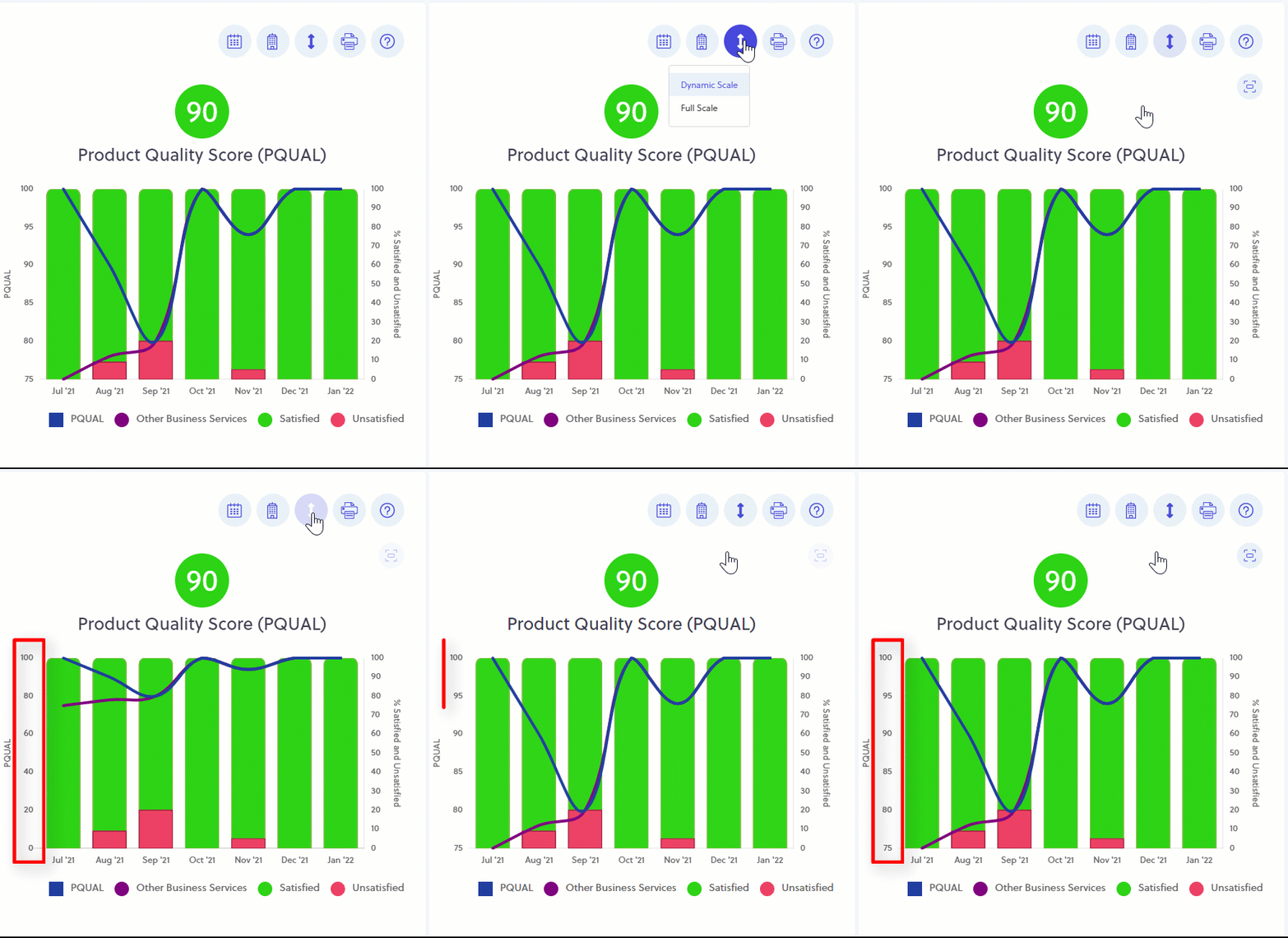
You can set the dashboard to display your Customer Experience charts using either "Full Scale" or "Dynamic Scale". Full Scale will show your trendlines on a scale from -100 to +100 (NPS®), and 0 to 100 (CSAT and PQUAL). Dynamic Scale only shows the scales based on the actual data of each chart. This helps you view variation in your trendlines more easily.
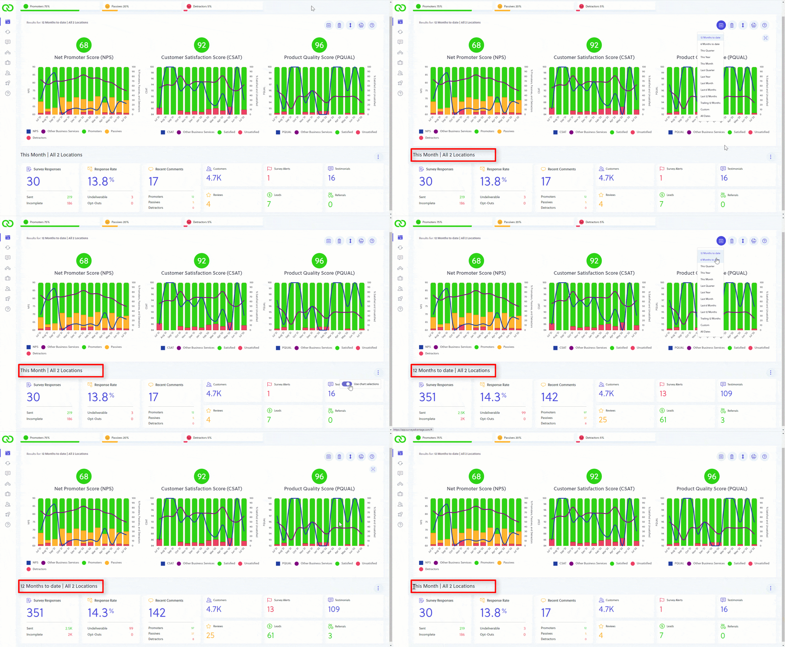
On the bottom of your dashboard you'll find a number of helpful widgets that display your results. You can click the 3 dot menu above and to the right of the widgets to set the date range to use the above chart date range or not. If not selected, the widgets display the results for "this month".
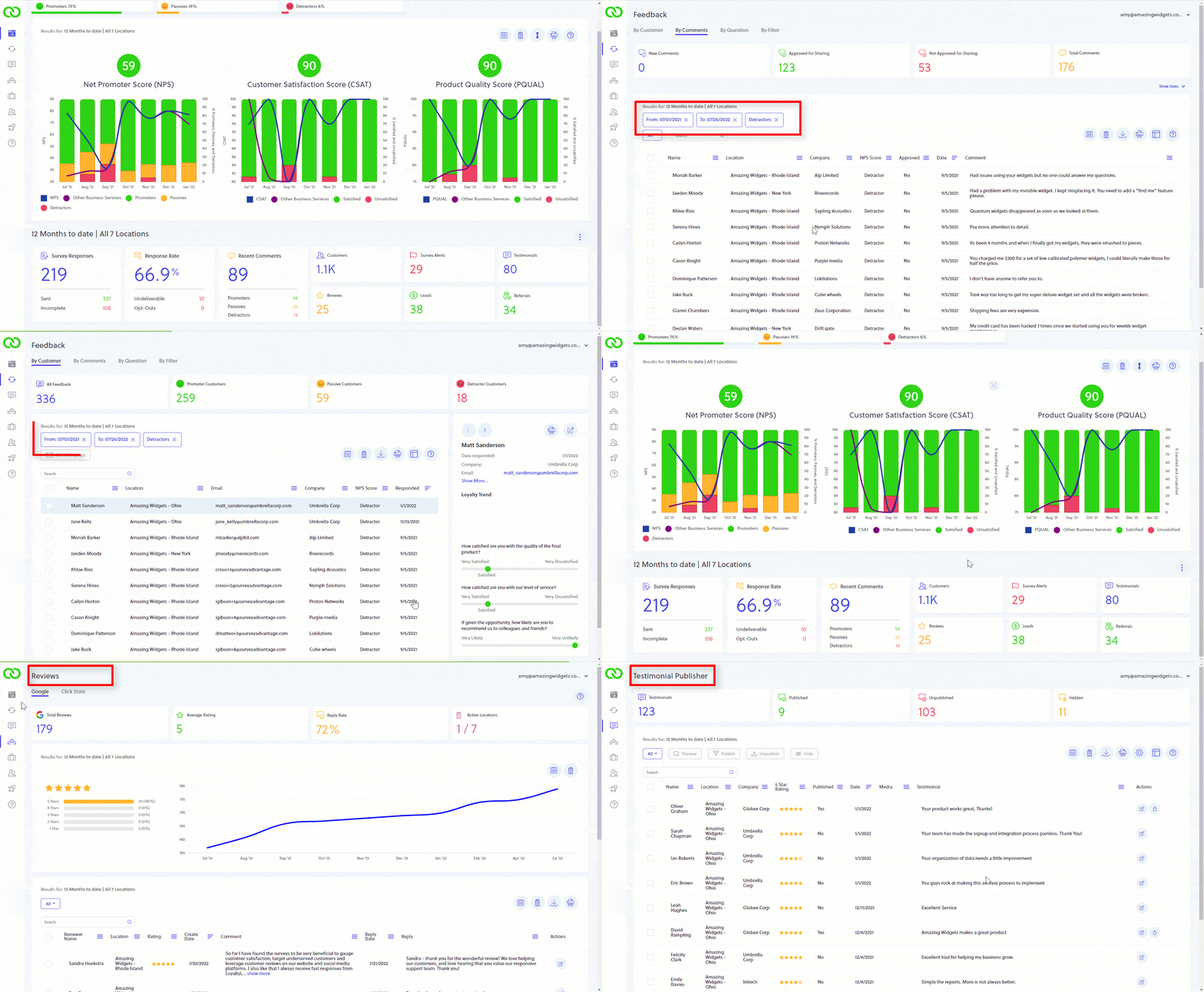
Clicking on the data values in the first 3 widget boxes on your dashboard, or clicking on the other widget boxes on your dashboard, will take you directly to that section of LoyaltyLoop. This is a great shortcut, for example, to find all your Detractor comments.
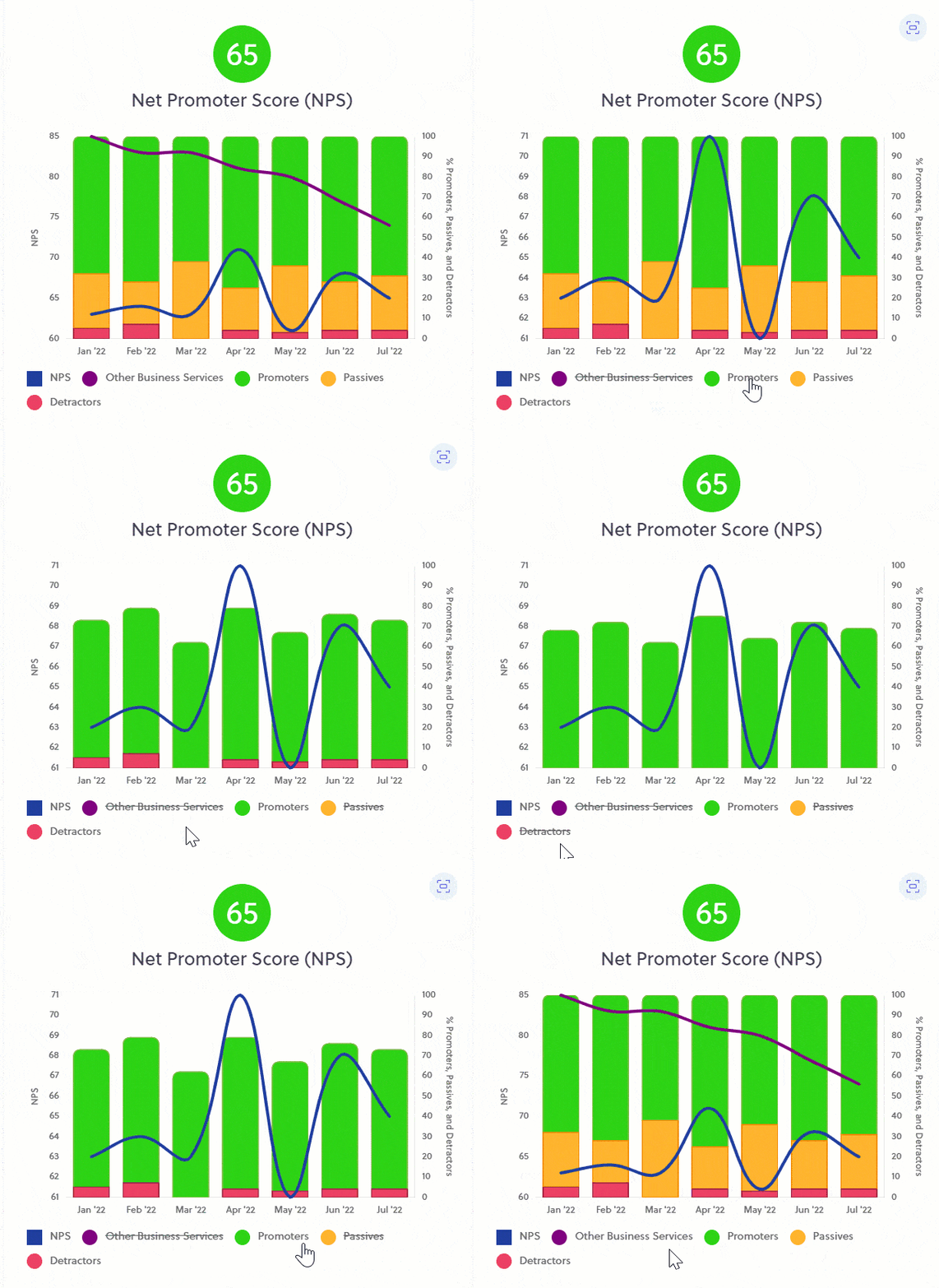
When viewing your charts, sometimes you may wish to remove an element to focus on certain results. To do this, simply click on the legend name of the item you wish to hide in the chart. To make it visible again, click the lined-out legend again.
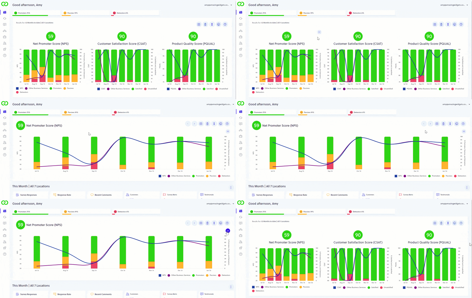
If you want to get a better view of your dashboard charts, you can maximize them. Move your mouse to the upper right region of any chart, and you'll see the maximize/minimize icon appear. Click it to maximize. When finished viewing your large chart, click the icon again to minimize it.
LoyaltyLoop Recognizes Leaders in Customer Loyalty for the Print and Sign Industries for Q2, 2022

LoyaltyLoop released their Print and Sign industry segment Loyalty Leadership awards for the quarter ending June 30, 2022. The awards recognize businesses in North America that attain the highest Net Promoter Score for their industry segment during the quarter. Results are based on over 24,000 survey responses from customers who recently completed a purchase and were asked how likely they would be to recommend the business to others.