Creating advanced reports using Feedback by Filter
View feedback in new insightful ways
Using Feedback by Filter can help you view customer feedback from different perspectives that can be extremely helpful and insightful. Let's review how to use this powerful feature.
To understand this feature, you first need to understand that it is only as good as the data you upload, email or send to LoyaltyLoop via an integration. When you include other data associated with your customer's transaction, that additional data can be used as a filter in this feature. For example, if you include the sales rep, regional manager, industry, product, SKU, or any other data associated with your customer's translation, you can create a report of feedback based on that data element.
Let's give a specific example of how you can use this powerful feature. We'll use our fictitious company Amazing Widgets as the example. When Amazing Widgets' data is received by LoyaltyLoop, they've chosen to include the Sale Rep who is associated with each customer transaction. The management of Amazing Widgets is interested to learn if there is any variation in their Net Promoter ScoreSM based on the Sales Rep managing the customer. To view this exact report, here's what Amazing Widget users do:
Step 1: they select the location or locations they wish to view
Step 2: they select the survey question that captures the information they seek. In this specific example, the Amazing Widget team is looking to see how customers answered the NPS question, so they select that one question.
Step 3: they select "Sales Rep" from the filter. This is the key metric in the report. Again, this data is a field (typically a column) in the data set you send to LoyaltyLoop along with your customer contact details.
Step 4: they select the date range for the feedback they wish to analyze
Step 5: they choose the metric to view, either NPS or Satisfaction calculate. NPS calculation uses the formula (% Promoters) - (% Detractors), a score of -100 to +100. Satisfaction calculation uses (% Satisfied) - (% Not Sure to Unsatisfied), a score of 0% to 100%. In this example, the Amazing Widget's user chooses NPS.
When they click Run Report, they see the summary of all their Sales Reps who were associated with the customers' survey. And each row shows the number of customers who rated Amazing Widgets on the NPS question, showing the aggregate NPS score customer's associated with each Sales Rep. By collapsing the table, the data is more easily viewed.
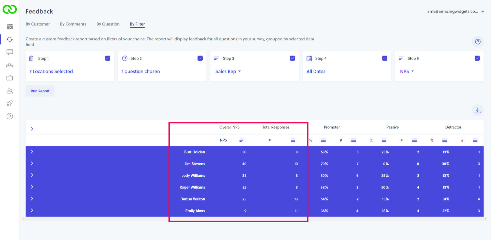
Look at the results. There are 6 Sales Reps, and the NPS ratings from customers vary from 50 to 9. That's a pretty wide variation. Very quickly, management can see that the customers who rated Amazing Widgets who are managed by Emily, rated the company with a low NPS of 9. On the other hand, 8 customers managed by Burt responded to the survey, rating Amazing Widgets with a 50.
Using Feedback by Filter, you can easily identify customer feedback variation like the above example, then implement corrective actions plans for continuous improvement to drive better customer experiences.
MORE CARROT, LESS STICK!
When viewing results like NPS by Sales Rep, Support Rep,
Technician and other staff-based metrics, we recommend using more "carrot" than "stick" with your team. Work to identify the ways
in which under-performing staff can improve performance relative to a metric. Build continuous improvement plans based on helping
under-performing staff improve, rather than using "stick" to reprimand staff.

Here's a video explaining how to use Feedback by Filter
Watch this short video to compliment the written instructions below.