LoyaltyLoop UI Overview
Navigating Your LoyaltyLoop Dashboard
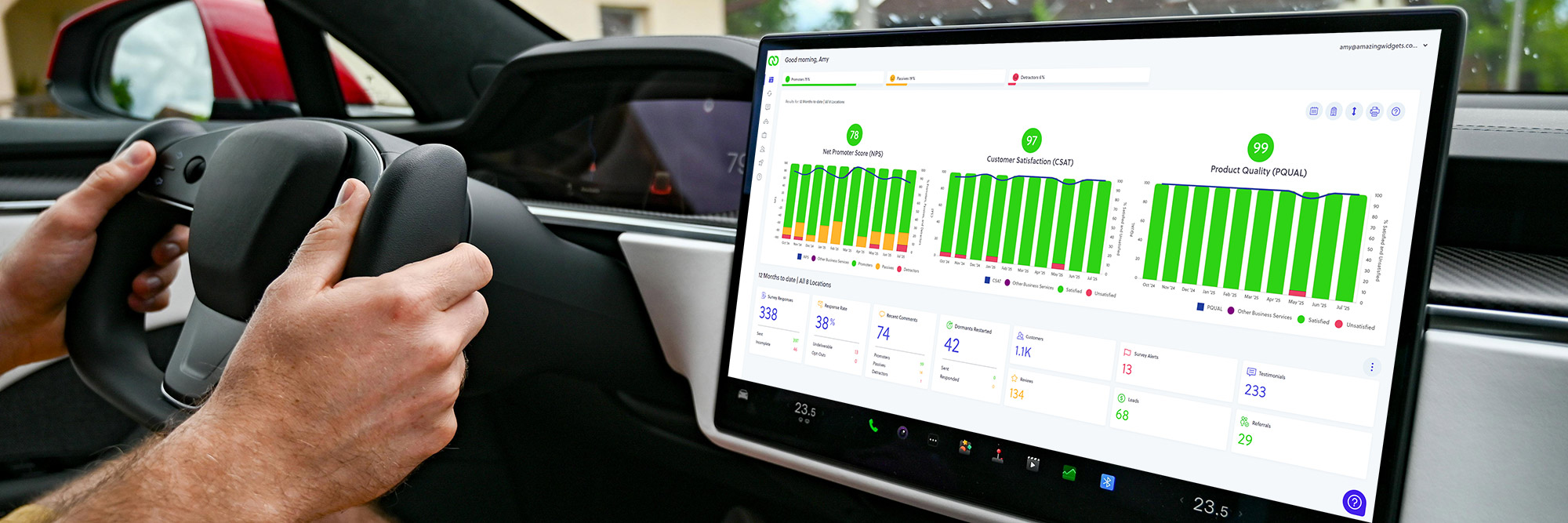
Original photo by Vladimir Srajber on Pexels
Your LoyaltyLoop Dashboard is the central hub for monitoring your customer feedback and results. It's designed to give you a clear, at-a-glance view of your performance, but there are a few built-in features you might be overlooking that can help you get even more out of it.
Here are four key tips for navigating and customizing your dashboard for a more insightful experience.
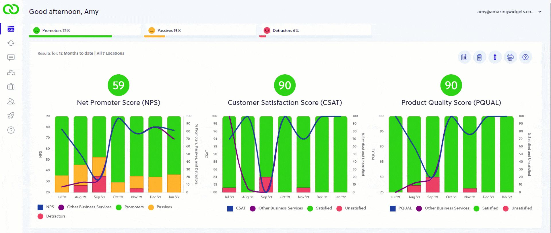
1. Get a Better View with Dynamic Scales
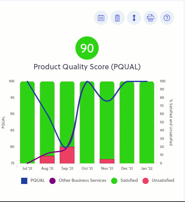
Did you know you can set dynamic scales on your dashboard charts?
The way your charts are scaled can significantly impact how you interpret your data. LoyaltyLoop gives you two options for viewing your Customer Experience charts:
- Full Scale: This is the default and shows your trendlines on a maximum scale:
- NPS®: −100 to +100
- CSAT and PQUAL: 0 to 100
- Dynamic Scale: This option only shows the scale based on the actual data present in the chart.
Why use Dynamic Scale? If your scores stay within a tight range (say, 75 to 85), a Dynamic Scale will zoom in on that range, making it much easier to view and track subtle variation in your trend lines over time.
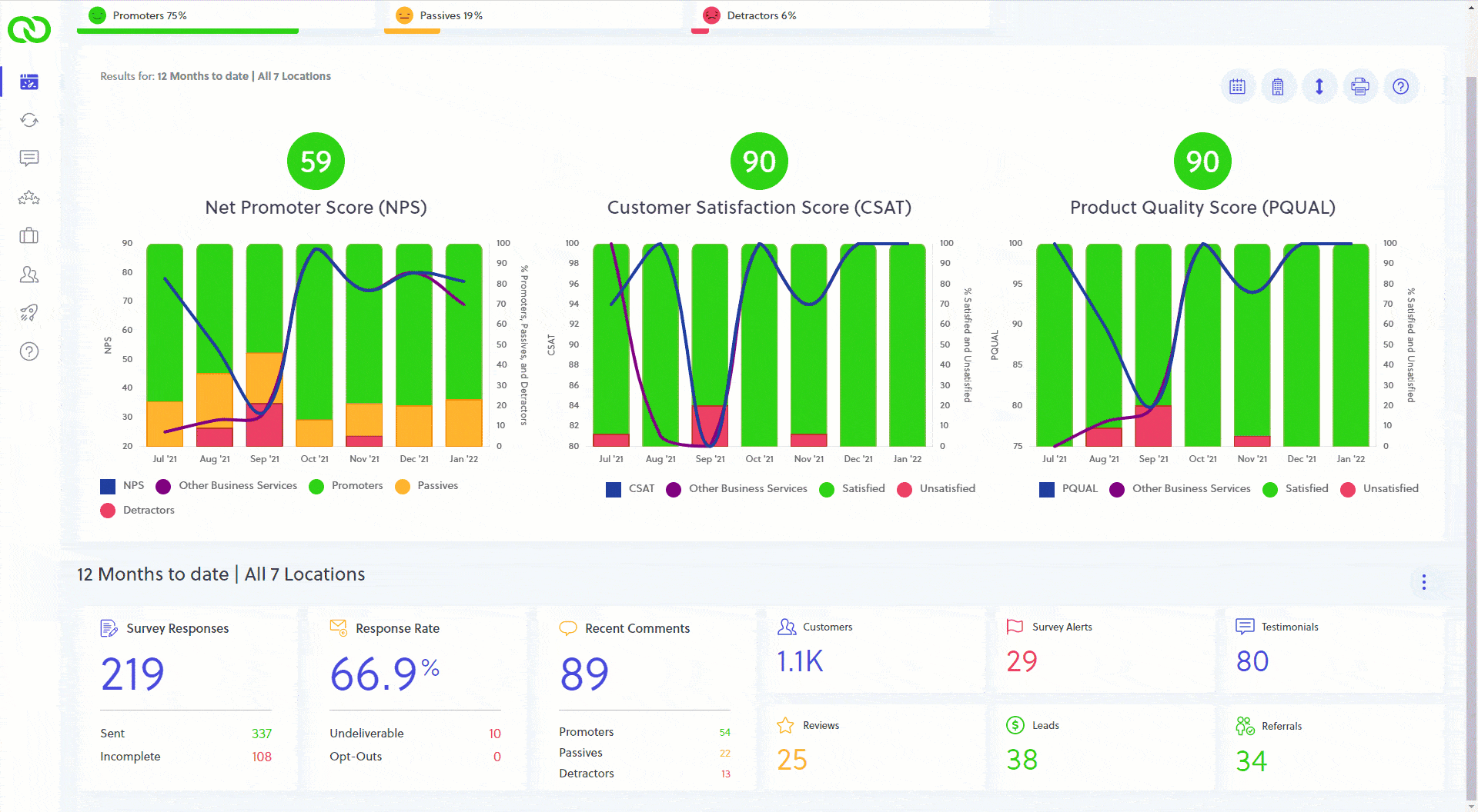
2. Customize Your Widget Date Range
Located at the bottom of your dashboard, the widgets are a set of helpful boxes displaying a snapshot of your current results. You have control over the date range these widgets use!
To change the settings, click the three-dot menu located above and to the right of the widgets. Here, you can choose to:
- Match the charts: Set the widgets to use the same date range you've selected for the charts above them (e.g., "last 90 days").
- View "this month": If the "match" option is not selected, the widgets will automatically default to displaying your results for the current month.
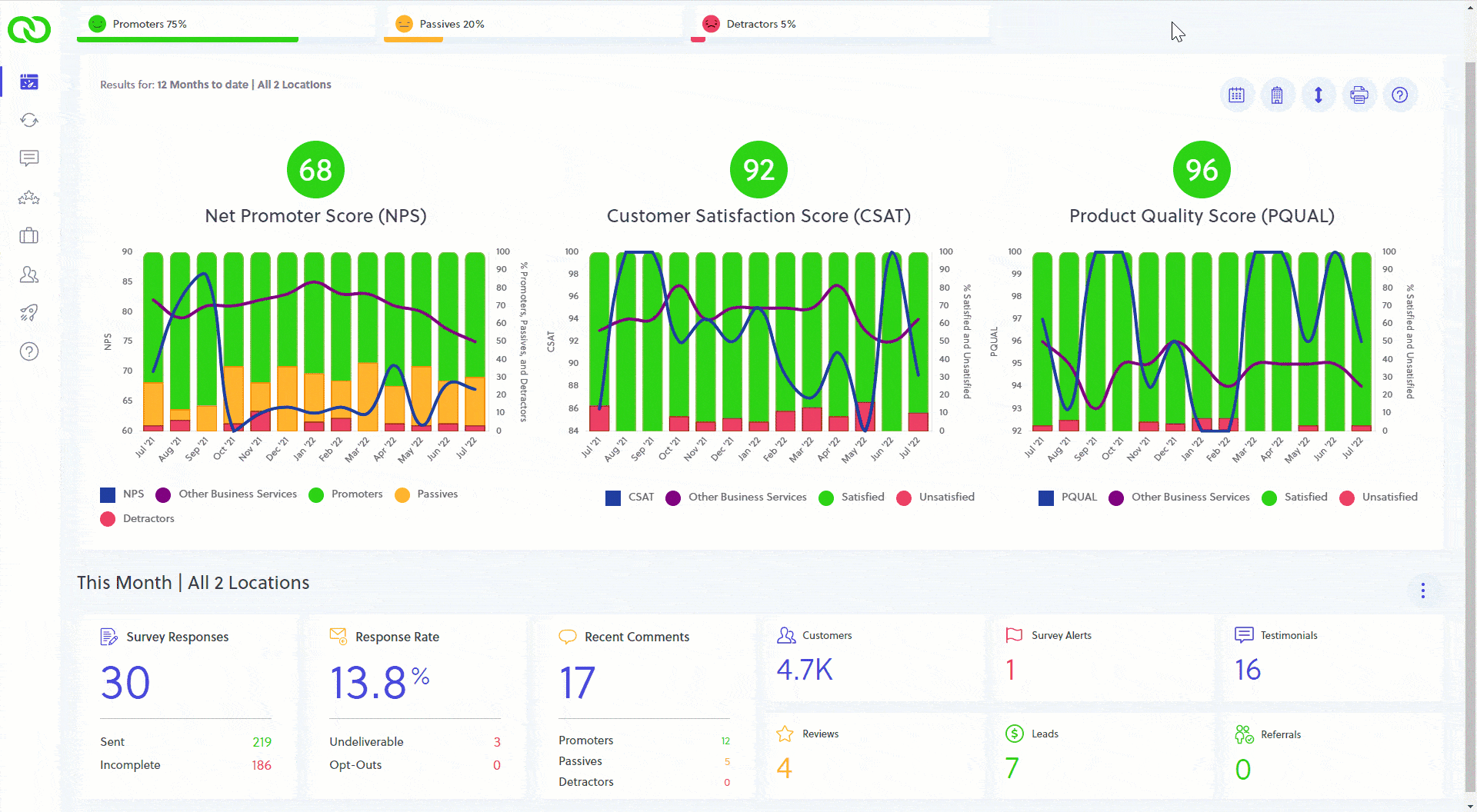
3. Your Widgets are Clickable Shortcuts
Speed up your workflow! Did you know your dashboard widgets act as direct shortcuts to deeper parts of LoyaltyLoop?
- Clicking on the data values in the first three widget boxes (like your number of Promoters, Passives, or Detractors).
- Clicking on any other widget box on your dashboard.
Doing this will take you directly to that section of LoyaltyLoop. This is a great time-saver. For instance, clicking on the Detractor count is the fastest way to view all of your recent Detractor comments and start your follow-up!
4. Maximize Charts for Easier Analysis
When you need to really focus on a specific trend, you can easily maximize any of your dashboard charts for a full-screen view.
Simply move your mouse to the upper-right region of any chart, and you'll see a maximize/minimize icon appear. Click it once to expand the chart for a better look.
When you're done analyzing the data, click the icon again to minimize it and return to your full dashboard view.
By using these four tips, you can transform your LoyaltyLoop Dashboard into an even more powerful, personalized, and efficient tool for managing your customer experience program.